


0
comments
Labels:
illustration
![]()
It seems one of the illustrators I love & and wrote about recently is the same person that did this print sold in The Hoxton Street Monster supplies, since it's opening last November.
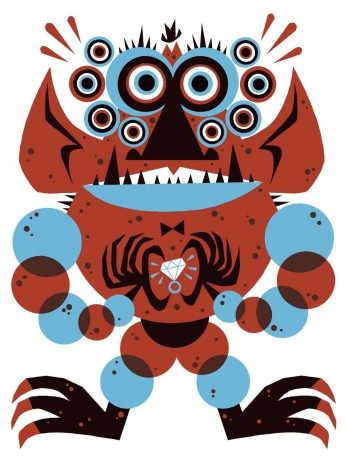 |
| 'Zingoula Cudacuda' by BEN NEWMAN |
4
comments
Labels:
cool.stuff,
illustration,
Shop
![]()
Like most women, I absolutely adore shoes in all their shapes, sizes and colours. I make snap purchases, without even considering whether they'll o with anything, or the practicality of them..but these, yes these people are SERIOUS un practical shoes. But I love them! They fuse my love of shoes and art in one.
Created by Israeli born footwear designer, Kobi Levi, these creations are a visual feast, forcing you to look twice and work out how this object can actually fit a foot inside it. Levi says of his work, "The piece is a wearable sculpture. It is "alive" with or without the foot or body".


0
comments
Labels:
cool.stuff,
fashion
![]()

0
comments
Labels:
digital,
film,
music,
Talks
![]()


0
comments
Labels:
illustration
![]()
Well BETC & Evian had a job on their hands to better their dancing babies ad of last year, but I think they've done a good job with the latest 'Evian Baby Inside'. This one uses a stop frame technique of adults waering t-shirts with babie's bodies printed from the neckline in various positions, giving the illusion that these people with 'young' bodies are dancing around. Ending with the famous 'Live Young' strapline. Well resolved.
Another fav I have put up for my own purposes is the 'Cats with thumbs' ad for Cravendale released earlier this year. I must've missed it as only by chance saw it through a youtube link. But it did make me laugh out loud:
By W+K London
0
comments
Labels:
advertising
![]()
Oh crap.
There almost always comes a time in a creatives' career when an idea that they had many moons ago sits idle in their book/ bottom drawer and it isn't long before someone goes and bloody makes the thing. Is that flattering or just a case of ideas existing out there somewhere and people tapping into it as and when appropriate? In my case it was a campaign I thought up for Topshop to make the shopper's experience more bearable and convenient for those with fast paced lifestyles. It was more a technological solution as such than a conceptual idea, but it was based on the frustrations many feel (especially in winter) at having to undress and re-layer up to try on an outfit, This way,m with my special mirror, shopper's can try on clothes of their choice with minimum effort.
However with ever changing technology and brand competition it was only a matter of time before something similar was made:

 |
| (All work shown above is original ideas by myself and not reproduced to the best of my knowledge at the time of production) |
0
comments
Labels:
digital,
My Work
![]()
 For anyone who gets obsessed with type to the point of actually being turned on by it - these are for you. Tart cards are the small flyers prostitutes advertise their services, and place in phone boxes. Yet these are designed with a twist. Using the names of well known typefaces, Fold7 design studio created these inviting you to be teased, spanked or dominated by a font. Although written with such wit, there is a serious cause being highlighted here. The sexual criminal underworld often subjects many to violent and horrid experiences. The Helen Bamber Foundation helps to rebuild lives broken by human rights violations, and an exhibition was held by all designers invited to take part in the project.


0
comments
Labels:
Graphic design
![]()


0
comments
Labels:
cool.stuff,
Events,
Graphic design
![]()


0
comments
Labels:
advertising
![]()
For anyone that was at glug a month or so ago, they will have seen the amazing video of the taxi art meticulously done in Mumbai - presented by Eliza of Creative Review. I had to put it up here as it was a nice to see a family run business still continued and brightening up the streets of the city. The craft that goes into making the graphic stickers is really quite amazing.


0
comments
Labels:
Graphic design
![]()
On my usual image search/ style reference came across this dude. Really liked it so popped it up here:
 | ||
|
0
comments
Labels:
illustration
![]()
A short delay for my follow up about The Story 2011 - I just like to leave you hanging...
To start from the beginning, click here. And if you're a start in the middle kind of person read on, that's cool...but you might be missing something good!
Basically I took part in a one day conference where top speakers presented what they believe makes up a story.
 Nick Ryan specialises in sound design and he introduced us to his now successful, audio game "Papa Sangre". I actually wrote a piece about it here, but it was great to hear the thinking behind it in full. Nick explained how by setting the scence & immersing players in a room of complete darkness, the sounds played to them allow them to visualise in their minds their own story. The senses are heightened once you remove sight, and the experience powerfully dramatic .
He also made an interesting point how we, from a very early age, associate different sounds with visuals automatically i.e like being shown in a picture book a cow and being told it makes the sound 'moo'. This in a similar way narrows our imagination of what sound can be, in the same way that adults become stifled by education, and are less imaginative than children. So similar sounds & effects are often used in film for instance as familiarity sets the scene for us.

0
comments
Labels:
art,
digital,
Events
![]()
Beautiful interactive film by Pentagram that explores the personality of typefaces by asking the viewer 'psychological' questions to determine their 'type'.
A Slavic speaking phrenologist asks four questions relating to your personality. The charm lies in the way he delves into your psyche: asking how relaxed you are by likening it to your approach to a box of chocolates. You are then presented with your 'type' and a short film telling you the history an characteristics of that font. I was Archetype Hairline - Modern, a straightforward appearance, with outbreaks of elegance and tiny dots of emotion.
 |
| Archetype hairline |
 |
| Archetype Van Doesburg |
0
comments
Labels:
film,
typography
![]()
Ok, so the latest trend going around is all this visual notetaking at conferences and seminars. Cool huh? Well yes and no. Take these done by Eva Lottchen at The Story 2011 that I attended. These are quite detailed and beautifully presented; in fact they save me on reporting on what happened since I haven't written up part two of my notes yet!

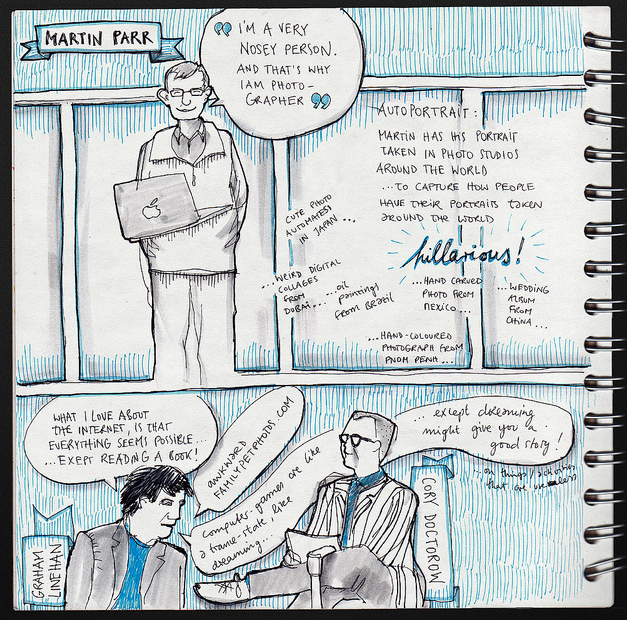
 |
| Nora Herting |
0
comments
Labels:
Events,
illustration,
Industry opinion,
trends
![]()
This rather neat deskstop app for Ikea by Hungarian agency Laboratory uses a very similar idea to that in my Muji 'Obsessive Compulsive Order' campaign. Only they have the technical know-how to make it happen. Neat.

0
comments
Labels:
advertising,
digital,
My Work
![]()


